Using Compose in MATLAB for Pretty Tick Labels
Creating descriptive and well formatted text labels for x- or y-ticks in MATLAB is essential to the presentation of your data. I have always struggled to remember the best way to replace tick marks and default numerical labels with text labels. I can not claim that the compose function in MATLAB is hidden, but I don’t see it used often and it performs precisely what is required in many of cases.
For example, you have sampled a reaction time (RT) distribution using 10 quantiles. In RT experiments the RT histogram will generally have some type of long-tailed distribution, therefore each quantile contains a different range of RTs.
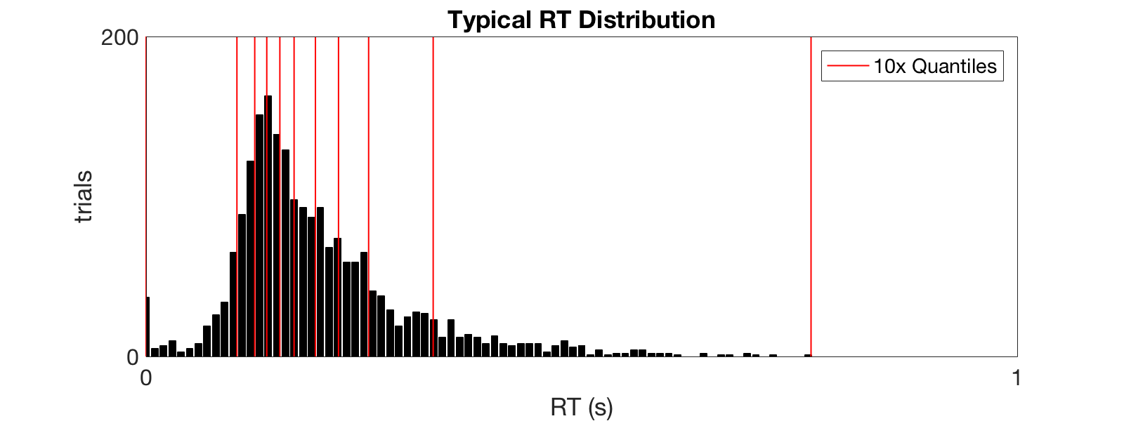
Let’s say you want to compare some neuronal firing rate associated with those quantiles of RTs.
% RTs = reaction times
% Zscores = Z score of neuronal firing associated with RT
RTs = [0.10758143999999 0.113643519999982 0.119705600000088 0.12435456000005 0.127467520000003 0.131112959999996 0.134963199999959 0.138751999999897 0.14278655999999 0.147066880000125 0.151367680000021 0.155709439999896 0.160829439999929 0.166154239999969 0.173260799999866 0.184340479999889 0.197160960000019 0.215386720000026 0.24209264000001 0.293253120000031];
Zscores = [1.91375996684532 2.11512451719412 2.31635992789693 1.97677278262753 1.83302457695781 1.76635184611673 2.58036012006912 1.40779739402557 2.29017317616969 1.44587687689824 1.76950209157802 1.60579505116933 1.69767216641066 1.87616271740106 1.75912513938938 1.41276581199477 1.23089211422587 1.03332795801901 0.863934150049046 0.683887429578394];

figure;
colors = cool(numel(Zscores));
markerSize = 50;
for iiRT = 1:numel(RTs)
    lns(iiRT) = plot(RTs(iiRT),Zscores(iiRT),'.','markerSize',markerSize,'color',colors(iiRT,:));
    hold on;
end

xticks(RTs);
xlabel('RT');
ylabel('Z score');
title('Z score vs. RT');
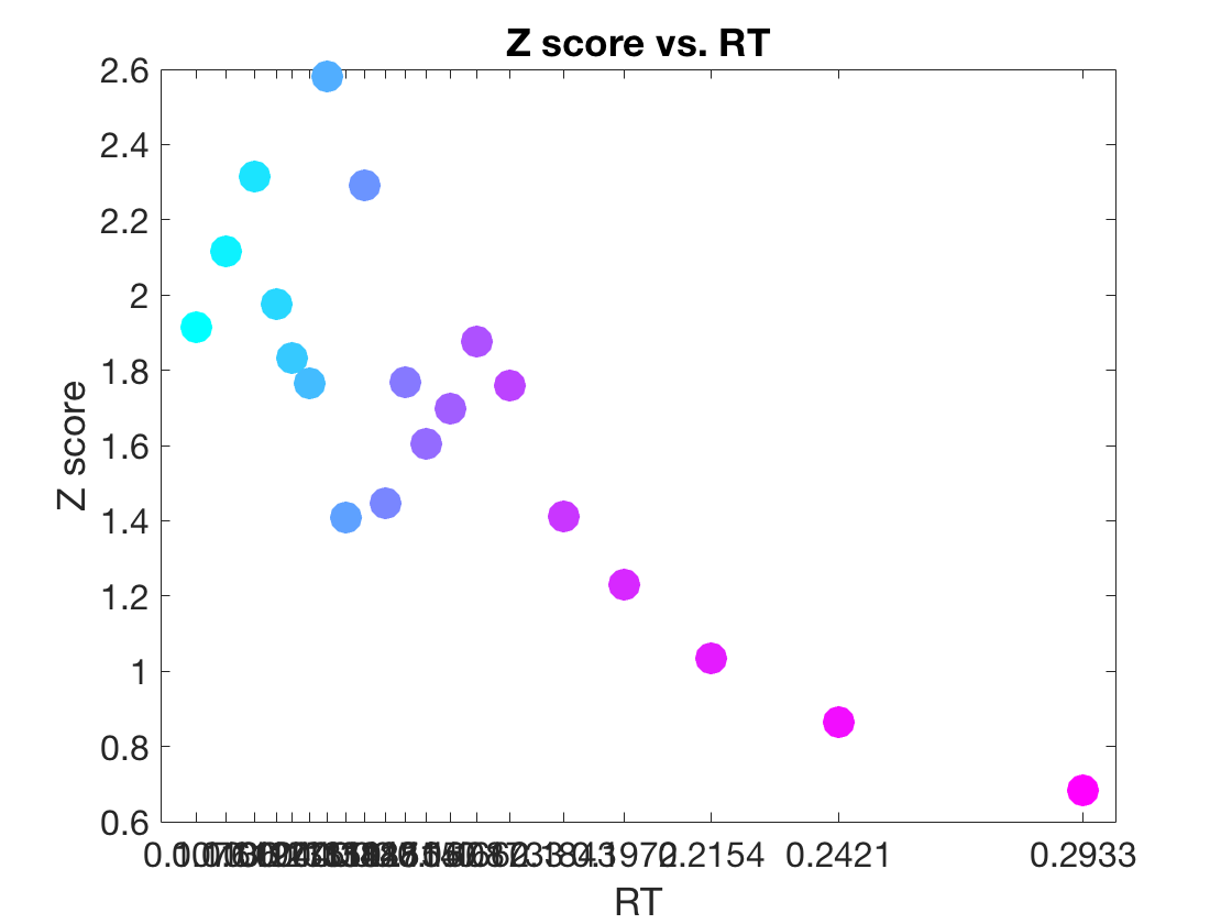
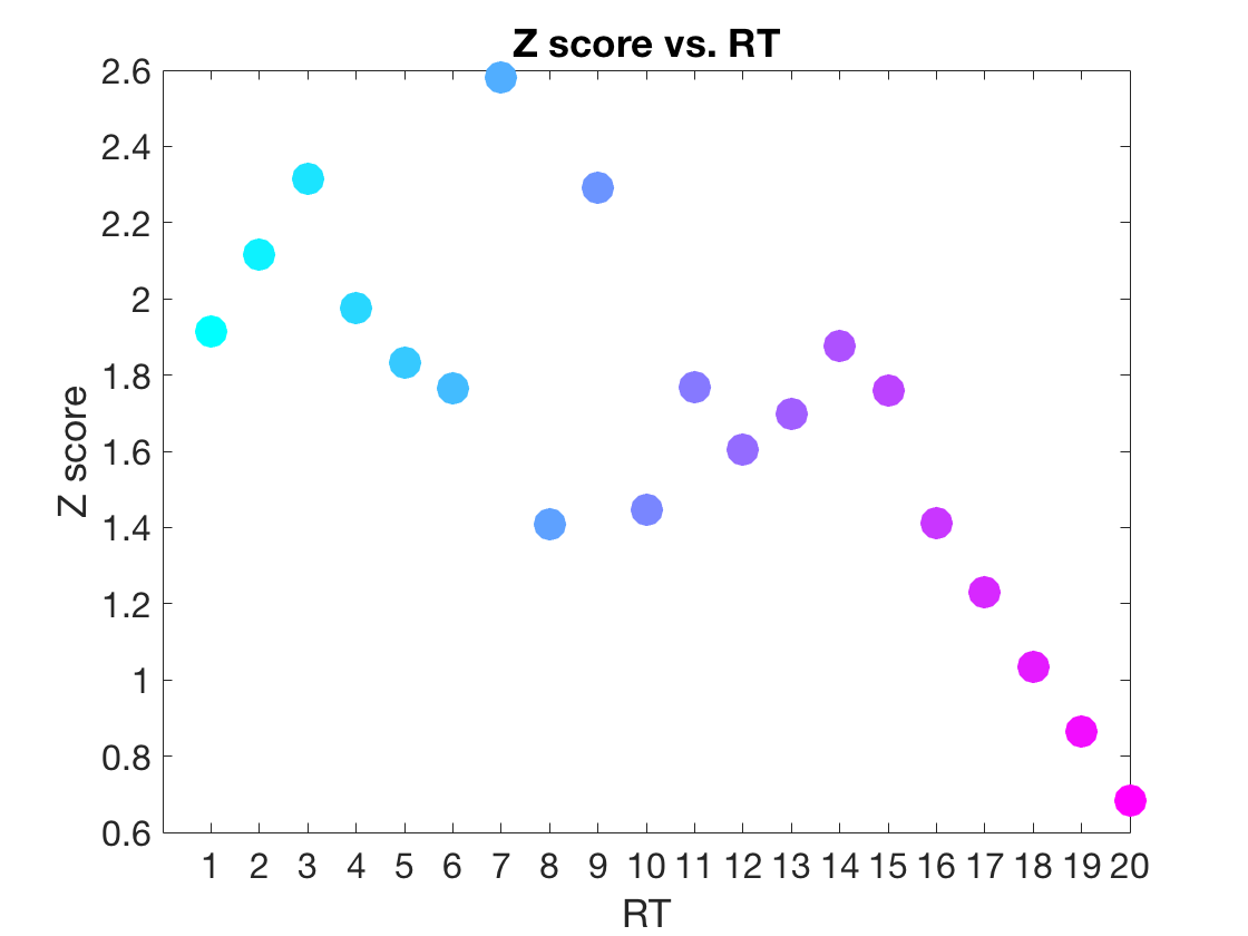
However, you may not want to all of those data points to cluster where the quantile spacing is tight. Therefore, you can plot the x-axis on a linear scale, but now your x-ticks do not represent RTs, rather, they are a linear scale.
figure;
colors = cool(numel(Zscores));
markerSize = 50;
for iiRT = 1:numel(RTs)
    lns(iiRT) = plot(iiRT,Zscores(iiRT),'.','markerSize',markerSize,'color',colors(iiRT,:));
    hold on;
end
xticks(1:numel(RTs));
xlabel('RT');
ylabel('Z score');
title('Z score vs. RT');
set(gca,'fontSize',16);
set(gcf,'color','w');
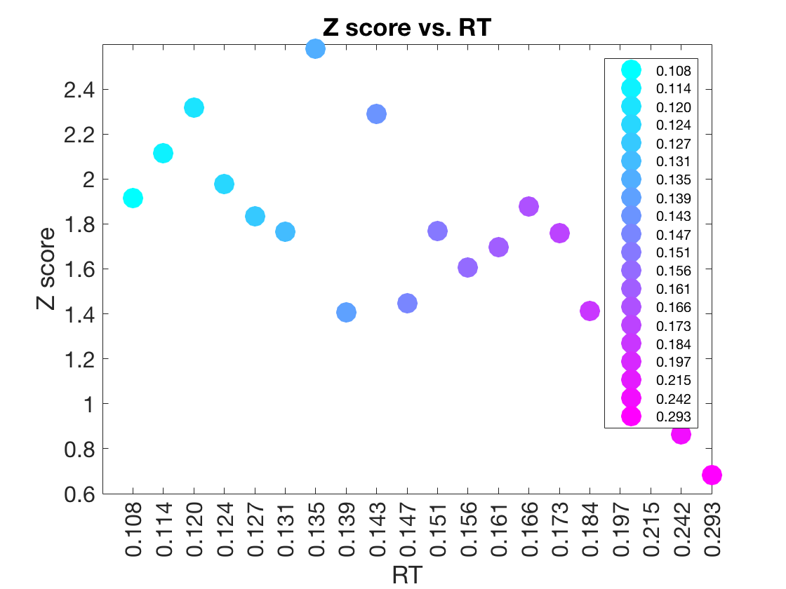
To correct this situation, you would want to replace those x-ticks with RT values. The primary issue when it comes to data presentation is formatting those ‘floats’ into something manageable and readable. Although it appears that xtickformat would accomplish this, it doesn’t appear to retain values set by xticklabels. In addition, using compose gives you access to a cell string that can be used in a legend.
RTs_labels = compose('%1.3f',RTs);
xticklabels(RTs_labels);
xtickangle(90);
legend(lns,RTs_labels,'fontSize',10);
* As a final note, although scatter would work instead of a FOR loop, it does not return independent handles for each point, so a colorized legend is not as easy to achieve.
